

13 Canvas Painting Ideas for Every Skill Level
A blank canvas is only intimidating without a plan for it. Every idea below is tied to a finished painting on this page, with a note on the one thing that makes it work — the value range, the edge quality, the empty space you have to be brave enough to leave alone.
Sizes are suggestions: most work from a 20×20 cm study up to a 60×80 cm statement piece, and several finish in an afternoon. They aren’t ordered by difficulty, so read the technique note before committing a canvas.
If the painting is destined for a wall rather than a shelf, measure before you stretch: the scale and colour rules in these living room wall art ideas explain why a canvas that looks generous on the easel can float once it is above a sofa.
1. A single-colour flower study

One earth pigment thinned right down — burnt umber or raw sienna — and nothing else. One colour forces you to solve the painting with value alone, and that skill carries into everything after it. Look at where the darks actually sit: the leaves and the stippled centres carry almost all of them, while the petals are barely more than bare canvas held by a drawn edge. Build those darks in three or four transparent passes, not one heavy one. The top third of the canvas is untouched, and leaving it alone is half of why the piece breathes.
2. A loose wildflower meadow with air around it

The hard part is restraint. No vase, no ground line, no cast shadow — the spray just exists on the cream, untouched canvas on every side. Each stem is one pulled stroke from a rigger brush; stop and restart and the line goes lumpy. Vary the heights so no two heads sit at the same level, and drop three or four deep crimson blooms among the pale ones — an all-pastel bouquet goes chalky fast. The same thin-paint logic drives these watercolour painting ideas for beginners if you’d rather test it on paper first.
3. A floating island carrying a ruined room

Surrealism holds together when one ordinary thing is painted convincingly, then put somewhere impossible. The rusted stove, the dresser, the shelves and the scattered jars are rendered straight; only the location is strange. Paint the clouds first as a soft stacked bank, let them dry, then drop the hard-edged rock and furniture on top — soft background against crisp subject is what sells the float. The only real colour in a near-grey painting is the turquoise panel behind the room, and one accent hue does more here than a full palette would.
4. Let the paint drip on purpose

Worth a second look at that same canvas, at the undersides only. The rock doesn’t end, it runs — and so do the clouds, the loose books and the chunks of debris. Drips are usually an accident; here they read as erosion and tie the island to the sky instead of leaving it pasted on top. Load a saturated brush along the bottom edge of the shape, stand the canvas upright, let gravity do one pass, then stop the runs at different lengths with a dry brush.
5. A greyscale fantasy world

An enormous moon with a spired city built into it, a broken stone arch, birds crossing the water. With no colour to lean on, depth comes from atmosphere alone: the far spires sit at mid-grey, the foreground rocks and wreckage drop to near black, and the water between them is the lightest note on the canvas. Block it out in charcoal first — the same value thinking behind these charcoal drawing ideas — then translate it to paint. If it doesn’t read as a thumbnail in three greys, detail won’t save it.
6. The same island, in daylight

Worth painting the same subject twice under different light: swap the storm for a pale blue sky and the mood flips from ominous to adventurous. Warm rust-orange cliff against cool sky is complementary, which is why it pops, and the satellite islands around the main mass keep your eye moving instead of parking it dead centre. The turquoise water pouring off the underside is the drip trick above used literally — same gesture, different story.
7. A cottage grown into a tree

A pale stone tower with a tiled turret roof rises out of the roots, an arched tunnel opens at the base of the trunk, and a red cherry and a small grey planet drift past on the right. Fairytale subjects fall apart when the architecture is vague, so give the stonework real courses curving with the tower and a real shadow inside the arch. The trunk is easier than it looks: block the tree in one mid-brown, then carve the bark back with darker paint following the twist of the wood. Keeping the floating objects opposite the tower stops a busy painting tipping over.
8. A clean tropical wave
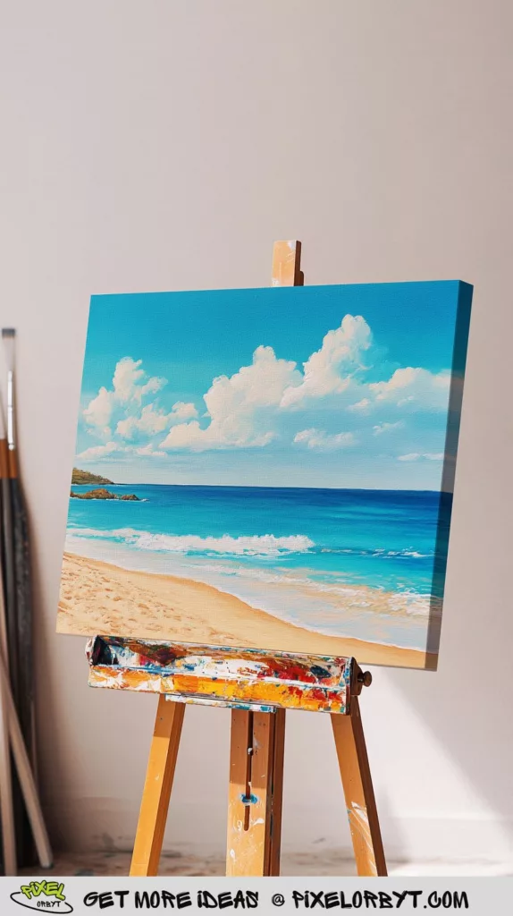
The most beginner-friendly painting here, and the best lesson in horizontal bands: deep blue at the horizon, turquoise over the shallows, white foam, wet sand, dry sand. Lay them in top down and blend only where two bands meet. The foam edge is the one place to slow down — scumble it with a dry brush so it breaks up, because a smooth drawn line there reads as fake. Note the sky carried around the side of the gallery-wrap canvas: five minutes’ work, and it never needs a frame.
9. Two loungers and a striped umbrella

Same beach, one story added. Two empty chairs imply people who have just walked off, and that narrative beats extra detail. The yellow umbrella is the only saturated colour here — everything else stays in soft blues and sand tones. Don’t skip the shadow pooled under the chairs; without it the group floats above the beach. It scales down well too, and these mini canvas painting ideas cover working that small.
10. A palette-knife city in black and white

No brush touched this. Towers are dragged upward with the flat of the knife, windows are the gaps where it skipped, and the smeared dark band along the bottom reads as a river without describing one. The values are stacked: heaviest black at the waterline, the tallest towers dissolving to near-white so the city stands in haze. Abstract skylines are forgiving, but you still need believable proportions under the mess — sketch the block heights first, using the logic in these two-point perspective city drawing ideas, then let the knife wreck the neatness.
11. Half a face, half raw texture

The ambitious one. A tightly rendered eye and half a mouth hold the left side; the right breaks off along a ragged line into thick pale grey texture paste. It works because the finished side is genuinely finished — the sharp catchlight in the iris, lashes painted individually, the wet highlight where the lower lip turns under, the cracked dry texture across the cheek. Get that right before you touch the paste; a rough half cannot rescue a weak half. Keep the tear line irregular — a straight split reads as graphic design, a broken one as damage. Work from reference photos and these portrait drawing ideas, never from memory.
12. Thick impasto flowers

The opposite of idea one. Paint straight from the tube, one loaded knife stroke per petal, and resist going back in — impasto turns grey the moment you overwork it. Lay the teal background first and leave slivers of it between the blooms so the bouquet has air inside it. Cluster the white flowers rather than dotting them about; scattered highlights stop the bouquet reading as one mass. Use heavy body acrylic or modelling paste, or the ridges slump as they dry. More in this vein: canvas painting ideas for beginners.
13. Misty mountains in a muted palette

Four values of grey-beige, one pine, done. Each ridge sits lighter than the one in front — that is all aerial perspective is — and the fog is the background colour brushed thinly back over the bases of the hills while they’re still damp. The dark pine gives the eye somewhere to land, and the golden dry grass along the foreground is the only textured passage, which is why it reads as close. It’s also the easiest piece here to live with; more terrain to work from in these landscape painting ideas.
Frequently asked questions
Do I need to prime a canvas I bought at the craft shop?
Shop canvases come pre-primed, but the coat is thin and thirsty. One extra layer of gesso, sanded lightly when dry, stops the first wash sinking in and going patchy — it matters most for thinned single-colour studies. Skip it for impasto, where the paint never reaches the weave anyway.
Acrylic or oil for these ideas?
Acrylic for hard edges over a dry background — the beach bands, the floating islands, the greyscale fantasy — because you can recoat in twenty minutes. Oil for the portrait and the misty mountains, where the paint must stay open long enough to blend wet into wet. New to it? Start with oil painting for beginners on something small.
What size canvas should a beginner buy?
20×25 cm or 25×25 cm. Big enough to move your wrist, cheap enough that ruining one costs nothing, and small enough to finish in a sitting — which matters most, because unfinished canvases stack up and stop you starting new ones.
How do I fix a painting I’ve overworked?
Let it dry fully, then decide; decisions made on a wet canvas usually make it worse. Most are muddy in one area only, and a flat opaque shape laid over it, borrowed from whatever borders it, resets that patch. If the whole surface has gone grey, gesso over it and reuse the canvas — the second attempt is always faster.
Pick two or three rather than reading all thirteen and starting none. The floral study, the beach bands and the misty ridges each teach a different fundamental — value, layering, atmosphere — and together they cover most of what the harder pieces are built on. After those, there are another 36 canvas painting ideas with a painted example for each to raid for your next surface.


