

33 Flower Coloring Pages: Easy Blooms to Detailed Florals
Thirty-three flower coloring pages, sorted from the thick-lined daisies a five-year-old can finish in ten minutes up to packed botanical scenes that will take you an evening. Every page below is described before you commit to it, so you know whether you are getting four fat petals or two hundred overlapping ones.

That opening page is a good benchmark for the whole set. Three big daisy heads, generous petals, and centres already filled with stipple dots so you do not have to invent the texture yourself. Anything on this list drawn at that line weight is comfortable for kids and for anyone using markers, which bleed and blur on thin lines.
Spring pushes flowers into scenes rather than isolating them on a plain background, and the 32 spring coloring pages lean that way — blossom branches, crocuses coming up through grass, faces crowned with cosmos.
Flowers turn up as costume rather than subject in the baby princess coloring pages, where one sheet builds a whole crown out of tiny blossoms and repeats them along the hem.
The pages get denser as you scroll. Sections 21 to 33 are where the fine-line meadows, the cropped sunflowers and the mandala-style symmetry live, and those reward colored pencils over anything wet. If you would rather draw the blooms than fill them in, the 28 easy flower drawings for beginners break each shape down to the form you lay in first.
1. Camellia Blooms in Dense Foliage

Two wide-open blooms sit one above the other, each showing a tight knot of stamens at the centre. The petals spiral outward in overlapping layers, which is the whole exercise here: shade each petal slightly darker where it tucks under the one in front, and the flower reads as three-dimensional instead of flat.
The background is packed with pointed leaves, and that density is your friend. Push the foliage to a deep, cool green and keep the petals pale pink or cream, and the blooms lift off the page without any extra work.
2. Two Bold Roses, Stacked

These roses are drawn heavy, with the petal spiral simplified into clean curved bands. That makes it one of the easier rose pages in the set and a sensible first attempt if rose petals normally defeat you.
Work from the centre outward and keep the darkest value in the middle of the spiral, where light physically cannot reach. If roses are the shape that keeps tripping you up, the 28 rose coloring pages take the same flower from a single minimal stem all the way up to full garden scenes.
3. Ribbon-Tied Bouquet

Flat-faced blooms with heavy vein lines, bundled above a looped ribbon and a spray of cut stems. The ribbon is the interesting part — it is the only non-botanical surface on the page, so it is your chance to practise a fabric fold.
Keep the ribbon a full step lighter than everything around it. A satin ribbon shows a bright highlight along the outer curve of each loop and drops sharply to shadow inside the fold, and that single contrast does more for the page than colouring every petal perfectly.
4. Garden Wildflowers, Edge to Edge

No white space anywhere. Cosmos and poppy shapes overlap in three depth layers, with buds and thin stems filling every gap. The trap is colouring every bloom the same intensity, which flattens the whole thing into wallpaper.
Pick four or five flowers in the front layer and give them your strongest saturation. Everything behind them gets a lighter, greyer version of the same hues. That is atmospheric perspective, and it is the single most useful habit to build on a busy page like this one.
One more thing worth noticing: the buds. There are a dozen unopened ones scattered through the drawing, and leaving them green while the open flowers carry colour gives the page a sense of a garden mid-season rather than a static arrangement.
5. Trumpet Lilies with Buds

Large open trumpets, long protruding stamens, and closed buds still wrapped tight, all sitting over strap-shaped leaves. The petals are big and unbroken, which makes this a good page for practising a gradient.
Lilies fade from a deeper throat out to a paler tip. Lay your colour heaviest at the base of each petal and lighten as you travel outward, then flick a few short strokes of a warm orange or rust onto the stamens so they read as pollen rather than sticks.
6. Jasmine Branch

Star-shaped five-petal blossoms scattered along a branch, with big smooth oval leaves between them. There is a real contrast built into this drawing: the flowers are almost detail-free while the leaves carry visible veining.
Lean into it. Keep the blossoms nearly white with the faintest cream or lilac wash, then take the leaves into a rich green with the veins darkened. The page stays calm and the flowers still read clearly.
7. Jasmine Cluster, Bolder Lines

The same flower as the previous page, drawn larger and with a much heavier outline. Blooms overlap and twist so that you are looking at some petals face-on and others in three-quarter view.
Those turned petals are the whole lesson. A petal seen at an angle is narrower and darker than one facing you, so shade the foreshortened ones a shade deeper and the cluster gains real depth. This one takes markers well thanks to the thick lines.
8. Anemone Bouquet, Hand-Tied

Anemones with dark stippled centres, sprigs of small filler flowers, and stems gathered into a wrapped bundle. The dense black centres are already the darkest value on the page, which gives you a free anchor.
Because those centres are so dark, you can go bright everywhere else without the page falling apart — magenta, coral, deep violet all hold up. Leave the wrap on the stems a neutral kraft brown so the eye keeps returning to the flowers.
9. Abstract Petal Field

Not a botanical drawing so much as a pattern. Tulip-shaped petals are packed against clusters of pebbled dots, and the artist has already laid in fine parallel line shading across most of the shapes.
That existing hatching means light colours work far better here than dark ones — a heavy layer will bury the line work you paid for. This page sits close in spirit to the 29 zentangle coloring pages, where the pattern rather than the subject carries the image.
It is also the best page here for a limited palette. Two colours plus the white of the paper, distributed so that neither dominates any one region, turns the pattern into something closer to textile design than a coloring page.
10. Simple Daisy Trio

Three daisies, thick outlines, dotted centres, nothing else. This is the most beginner-friendly page in the collection and the right one to hand a child or to use as a warm-up before something denser.
Because the shapes are so open, it is also the best page here for testing a palette. Colour the same three flowers twice in different colour schemes and you will learn more about what works than from finishing five complicated pages.
11. Rose Garden Behind a Fence

A picket fence runs across the top with dozens of small roses banked in front of it, each one only a centimetre or two across. It is a scene rather than a study, and the roses at the back are deliberately simplified.
Do not fight that. Colour the front row of roses properly, then treat everything past the middle as blocked-in colour with no internal shading. Fully rendering every distant bloom is what makes garden pages look busy and dead.
The fence gives you a ready-made horizontal to work against. Keeping the pickets a light warm grey rather than white stops them competing with the roses, and a shadow under the bottom rail settles the whole garden onto the ground.
12. Daisies in a Ribbed Vase

Eight daisy heads fan out above a round vase with horizontal ribbing. The vase is the one curved solid object on the page and it deserves more attention than most people give it.
Shade it as a cylinder: darkest along both outer edges, lightest in a vertical band just off centre. Follow the ribbing with your pencil strokes rather than crossing them, and the glass or ceramic reads convincingly in about two minutes.
13. Floral Mandala in a Diamond Frame

A single symmetrical bloom with pointed petals, set inside a diamond frame with striped bands top and bottom. Symmetry is the rule here, and breaking it is what makes mandala pages look wrong.
Work in rings rather than by area: finish every petal in the innermost ring before moving out. If you like this structure, the 20 easy mandala designs for beginners show how the same radial layout gets built from the centre outward.
Colour choice matters more than usual on a mandala because there is no subject to fall back on. Two colours alternating around each ring, with a third reserved for the frame, is a safe structure that still looks deliberate.
14. Wildflower Cluster with Berries

A tight cluster of daisy heads and rounded blooms with small berries and leaf sprays filling the gaps. Three or four distinct flower types share the frame, which is an invitation to overcomplicate.
Limit yourself to two flower colours plus green. Repeating a colour across non-adjacent blooms ties the arrangement together, whereas giving every flower its own hue turns it into a swatch chart.
15. Bold Cosmos and Buds

Big open cosmos faces with heavily stippled centres, surrounded by buds and small round berries. The line weight is generous and the shapes are large, so this one suits markers or heavier pencil pressure.
The stippled centres want a warm colour — ochre, rust, deep gold. Cool centres on warm petals look off because pollen in life is almost always warm-toned.
16. Single Chrysanthemum Study

One chrysanthemum, drawn as a dense sphere of narrow curved petals over a straight stem and deeply lobed leaves. There must be a hundred petals in that head, and colouring each one separately will take an hour and look chaotic.
Treat the whole bloom as a ball instead. Decide where your light is coming from, shade the entire lower-left of the head darker regardless of individual petals, and only then pick out a dozen petal edges with a sharper point. Form first, detail second.
17. Close-Up Pansy

A pansy filling most of the frame, its petals crossed with fine radiating veins, set against a vertical striped background with grass blades at the base. The composition is already doing the work — a single subject, cropped close.
Pansies have a dark blotch at the throat that bleeds outward along the veins. Lay your base colour first, then run a darker shade from the centre outward along those existing vein lines while the base is still light. That radial bleed is what makes a pansy look like a pansy.
The striped background is optional. Left white, the pansy floats and the page reads as a botanical study; filled with a soft neutral, the stripes become a fence or a trellis and the flower sits in a garden. Decide which you want before you start.
18. Twin Roses, Heavy Outline

The simplest rose page here. Two blooms, thick stems, broad serrated leaves, and outlines heavy enough to survive markers without the ink drowning the drawing.
The leaves are as much of the picture as the flowers, so vary them. Rose foliage is rarely one green — the new growth at the tips runs red-bronze, and dropping that warmth into two or three leaves stops the green from going flat.
19. Four Roses on One Stem

Four roses at different stages share a branching stem: one fully open at the top, one half-open, two still cupped. Having all the stages side by side is genuinely useful reference if you also draw.
Colour them slightly differently to match their age. Roses deepen and warm as they open, so let the tight buds sit greener and paler and the fully open bloom carry the most saturated colour on the page.
20. Wildflowers Inside a Circle

Poppies and tall grass heads arranged inside a plain circular border, with wide white margins all around. The frame changes how you should approach it: this is a design, not a scene.
Let some stems cross the circle line rather than stopping at it — that small break is what keeps a framed composition from looking like a sticker. Leave the margin white; the emptiness is doing real work.
21. Fine-Line Meadow Strip

A tall vertical strip of meadow: poppies, unopened buds, lavender-like spikes and grass stems, all drawn with a noticeably lighter line than the pages above. Markers will overwhelm this one.
Use colored pencils with a sharp point and light pressure, and let plenty of paper show through. Meadow pages look best slightly underdone. Pairing wildflowers with wings works well too — the 26 butterfly coloring pages use the same kind of loose floral backdrop.
22. Cropped Sunflowers

Sunflower heads zoomed in so far that the petals run off all four edges. The stippled centres are enormous, and they will eat a lot of pencil.
Build those centres in at least three values — a mid brown overall, a deeper brown on the shadowed side, and a few dots of near-black — or they turn into flat discs. Sunflowers get a full collection of their own in these 29 sunflower coloring pages, from thick-line cartoons to botanical studies.
Cropping this tight means the petals leave the page on all four sides, so there is no outline to contain your colour. Work slightly past the paper edge rather than stopping short — a thin white gap around a cropped image immediately looks like a mistake.
23. Wild Rose Branch

Wild roses have five flat petals and a dense burst of stamens instead of the packed spiral of a garden rose. This branch carries three open blooms, two buds, and a run of oval leaves.
The stamens are the focal point, so give them the warmest colour on the page and keep the petals pale. A soft blush pink with the barest hint of shadow where each petal meets the centre is all these need.
24. Open Cosmos Spray

Five cosmos blooms on slim stems, each with a clean ringed centre and generous rounded petals. It sits right in the middle of the difficulty range for this set: open enough to be quick, detailed enough to be satisfying.
Cosmos petals have faint lengthwise ridges. Stroke your pencil from the centre outward following the petal direction rather than scrubbing in circles, and you get that subtle ribbing for free.
25. Overflowing Vase Arrangement

The most crowded page in the collection. Roses, peonies, dahlias and filler sprigs spill out of a ribbed urn-shaped vase, with the whole arrangement drawn in fine, light line.
Plan this one before you touch it. Choose three or four hero blooms, colour those fully, and keep everything else in a muted supporting range. Trying to render all forty flowers at equal intensity is how a page like this takes four hours and still looks unresolved.
The vase itself is worth the same cylinder treatment as number 12, but with one addition: a packed arrangement casts shadow down onto the rim, so darken the top edge of the vase where the flowers overhang it. That single shadow connects the bouquet to its container.
26. Airy Cosmos Stems

Tall cosmos on thin stems with plenty of air between them, drawn in the faintest line of any page here. There is more paper than ink in this composition.
That white space is the design. Resist the urge to add a background — colour only the blooms and the foliage sprigs, and the page keeps the light, sparse feel the drawing was built for.
27. Anemone Posy

A gathered posy of anemones with buds and pointed leaves, narrowing down to a single hand-held stem. The blooms sit at different angles, some face-on and some tipped away.
Those tipped flowers are the interesting problem. A flower turned away shows an ellipse rather than a circle, so keep its centre off to one side instead of dead middle, and shade its far petals down. Get that right and the posy stops looking pressed flat.
28. Pansy Over a City Street

The oddest page in the set, and the most fun. A single oversized pansy stands in the middle of a city street drawn in strict one-point perspective, buildings shrinking away on both sides.
The scale contrast is the point, so keep the city grey and near-monochrome and let the flower carry every saturated colour on the page. If the perspective boxes appeal to you, the 29 landscape coloring pages run from simple horizons to heavily detailed scenes.
The buildings are drawn with converging lines that all meet at a single point behind the flower. If you shade them, keep your pencil strokes parallel to those existing lines rather than crossing them, and the perspective stays crisp instead of muddying.
29. Daisy Mosaic

Daisy and cosmos heads packed edge to edge with no stems and no background, and the artist has varied the centres deliberately — some dotted, some ringed, some solid.
Use those centre textures as your organising system. Give each centre type its own colour and repeat it across the page, and a design that could easily become noise gets a rhythm the eye can follow.
With no stems or background, the only depth cue available is value. Darkening the petals of a few heads near the edges and keeping the central ones bright creates a subtle dome effect and stops the mosaic reading as flat tiling.
30. Four Large Pansies

Four pansies drawn large with wide flat petals, clear vein lines and bold outlines. Compared with the close-up at number 17, this one gives you four chances at the same shape.
Vary them on purpose. Pansies come in solid colours and in two-tone forms where the lower petals are darker than the upper, so colour two of each and the group looks like a real planting rather than a repeat.
31. Chrysanthemum in Soft Line

The same subject as number 16, drawn with a much lighter touch — thinner outlines and delicate feathered foliage. Side by side, the pair shows how much line weight changes the mood of an identical flower.
Match your pressure to the drawing. Light line work asks for pale, layered colour built up in several passes rather than one heavy application, otherwise the pencil swamps the delicate leaves entirely.
32. Daisy Meadow with Grass

Daisies at every angle with tall grass blades filling in behind them. Some blooms face the viewer, others tilt away, and the grass runs right to the top of the frame.
Grass is the easiest place to add depth. Use two greens — a warmer, lighter one on the blades that cross in front of the flowers and a cooler, darker one behind — and the meadow gains a back and a front without any extra drawing.
Daisy petals are white, which means you barely colour them at all — a whisper of grey-blue on the shaded side of each petal and nothing else. The colour on a page like this lives in the grass and the centres, not the flowers.
33. Two Minimal Blooms
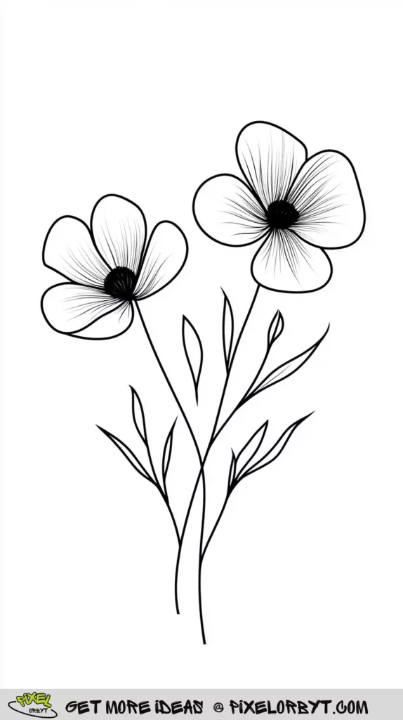
Two five-petal flowers with solid dark centres on thin stems, floating in an almost empty page. The least demanding drawing in the collection and, if you use it well, one of the most striking.
With this much white space every decision shows. One confident colour, cleanly applied, beats three blended ones. It also makes a good bookmark or card front once trimmed. For a longer set in the same vein, there are 42 more flowers coloring pages sorted by flower type.
Choosing the Right Page for the Time You Have
The pages above vary far more in difficulty than a thumbnail suggests, and picking badly is the main reason a coloring session ends half-finished. Two things predict how long a page takes: line weight and the number of separate enclosed shapes.
- Thick lines, few shapes — numbers 10, 18 and 33. Ten to twenty minutes, marker-safe, and fine for children.
- Medium detail — numbers 1, 5, 12, 17, 24 and 30. Around half an hour to an hour with colored pencils.
- Fine line, dense — numbers 4, 9, 21, 25 and 26. An evening or more, and pencils only. Wet media closes up the small shapes.
- Scenes with depth — numbers 11, 20, 28 and 32. These need a plan for what sits in front and what recedes before you start.
If in doubt, print two copies. The first one is where you find out that your background green is too bright; the second is where you get it right.
Tools That Suit These Pages
Colored pencils handle the whole range, and they are the only option that works on the fine-line meadows. Buy fewer, better pencils rather than a tin of sixty — twelve wax-based pencils that layer properly will outperform a large cheap set every time.
Alcohol markers are quick and give flat, vivid coverage, which suits the bold-outline pages. They bleed through most printer paper, so put a spare sheet underneath. Gel pens earn their place at the very end: a white gel pen adding a highlight along the top edge of a petal takes seconds and lifts a finished page noticeably.
Print on the heaviest paper your printer accepts. Standard copy paper buckles under three layers of pencil, and 120gsm or above holds up to blending without pilling.
Building a Palette That Holds Together
Most flower pages fail on colour, not technique. A few reliable approaches:
- Analogous — pick three colours that sit next to each other on the wheel, such as pink, coral and orange. Almost impossible to get wrong.
- Complementary accents — a mostly purple page with a few yellow flower centres. The small amount of opposite colour is what makes the rest sing.
- One hue, many values — five shades of blue across a whole page. Depth without any colour clashes, and it teaches you to see value rather than hue.
- Seasonal — burgundy, forest green and navy for winter pages; soft pink, lavender and pale yellow for spring ones like the meadows and cosmos.
Whatever you choose, keep one colour dominant and let the others support it. Equal amounts of three colours always looks unresolved.
Techniques Worth the Effort
Layer light to dark. Lay a pale base over the whole shape first, then build shadow in two or three passes. Starting dark leaves you no room to correct.
Pick one light source. Decide it before your pencil touches paper and shade every flower on the page as if the light came from there. Inconsistent lighting is the most common reason a carefully coloured page still looks amateur.
Follow the form. Stroke along the direction a petal grows, from centre to tip, rather than scrubbing back and forth. The stroke direction alone suggests curvature.
Leave white. Untouched paper is the brightest highlight you will ever get, and no white pencil can match it. Plan where it goes instead of colouring around it by accident.
Flower Coloring Pages: Common Questions
Can I print these coloring pages for free?
Yes. Right-click any image on this page, save it, and print at A4 or US Letter. They are free for personal and classroom use. Set your printer to “fit to page” so the fine-line designs do not lose their thinnest strokes at the edges.
Which flower coloring pages are best for young children?
Numbers 10, 18 and 33. All three have thick outlines, large open shapes and few separate areas to fill, which means crayons and markers stay inside the lines and the page gets finished in one sitting. Avoid the fine-line meadows at 21 and 26 until a child is comfortable with a sharpened pencil.
How do I stop my colored pencils from looking streaky?
Streaking comes from too much pressure too early. Use a light circular motion for the first layer, build up three or four passes, and keep the pencil sharp — a blunt tip drags wax across the paper instead of laying it down. A colorless blender pencil over the finished area smooths what remains.
What colours should I use for realistic flowers?
Look at a photograph of the actual bloom before choosing. Real petals are rarely one colour: a rose runs from deep crimson in the shadowed centre to a pale, almost peach edge, and daisy petals carry a faint grey-violet on their shaded sides. Adding a touch of the complementary colour into the shadows — a little green in the shadow of a red rose — reads as realistic far more than simply using a darker version of the same pencil.
Do I have to colour the background?
No, and often you should not. Pages 20, 26 and 33 are designed around their white space, and filling it in flattens them. On the crowded pages, leaving the background paper white is also the quickest way to push the front layer of flowers forward.
Print a few, keep the pencils sharp, and let the simpler pages be the ones you experiment with. The daisies do not mind.


