29 Landscape Coloring Pages: Simple to Highly Detailed
Twenty-nine landscape coloring pages, sorted here from wide-open farmland down to a single cobbled path. Some are eight lines and a horizon; others hide a shepherd, a flock and a rocky streambed in the same frame. Each one below comes with a note on what the drawing is actually asking of you — which part will fight you, and which part to leave alone.
The scenes cover mountains, meadows, bridges, villages, desert dunes, a lakeshore and a tropical bay, so there is something here whether you have twenty minutes or a whole quiet afternoon. If you would rather draw scenery than colour it, our scenery drawing ideas work through the same subjects from a blank page.
Several of the 32 spring coloring pages are landscapes in their own right — a cottage behind a wooden bridge, a blossom tree leaning over a path out to the hills — if you want scenery with a seasonal slant.
29 Landscape Coloring Pages, Simple to Highly Detailed
Work through them in order or pick by mood. The simplest pages are numbered 15, 24 and 25; the most demanding are 18, 19 and 29.
1. Castle Above the River Gorge

Three distances are stacked in one page here: the castle and its towers up on the rock, the arched bridge in the middle, and the boulder-strewn river running out toward you. Colour them in that order and keep each one a step lighter as it goes back, or the castle will crowd forward and flatten the whole gorge.
The water is the easiest thing to overwork. Leave the parallel current lines mostly white and lay a pale blue-grey only in the bands nearest the rocks — the untouched paper reads as glare on the surface. A darker shadow under the bridge arch is what makes the arch look like it is holding something up.
Palette worth trying: warm sandstone and rust on the castle, a cool grey-green through the gorge walls, and one accent — a red pennant or a red roof tile — somewhere high on the towers. A single warm spot in a cool page tells the eye where to land.
2. Rolling Farmland with Ploughed Furrows

The furrows fan out from a point near the farmhouse, which is doing all the perspective work in a page that otherwise has almost no detail. Follow the curve of each line rather than colouring straight across the field and the ground will look ploughed instead of striped.
A good trick on this one: alternate two close greens or a green and a wheat-gold between bands of furrows. The contrast can be slight — the eye reads the rhythm long before it reads the colour. Save your darkest tone for the strip of hills behind the house so the field stays open.
If you want a harder version of the same page, colour it at dusk instead: drop the whole field into muted violets and browns, then light only the farmhouse windows. The line work supports it, and you learn far more about value than you would from a green field.
3. Hillside Village with Towers and Flags

Dozens of roofs, gables and pennants are packed onto this slope, and colouring each one differently turns it into confetti. Pick three or four roof colours — a terracotta, a slate, a deep green — and repeat them across the hill. Repetition is what makes a crowded village read as a single place.
Leave the mountain outlines behind the towers nearly bare, a whisper of grey at most. If the village is the busiest and darkest thing on the page, the eye stays where it belongs. Anyone who enjoys buildings as the main subject will get on well with our house coloring pages, where the cottage is the star and the meadow is only the setting.
Watch the flags. They are tiny and it is tempting to leave them, but three or four bright pennants scattered across the roofline are the only saturated colour the page needs, and they lift the entire village.
4. Cottage Below the Jagged Peaks

The stepping stones in the stream are the detail worth slowing down for. Give each stone a light top and a darker underside on the same edge and they lift off the water; colour them flat and they turn into grey pebbles glued to a blue ribbon.
The peaks behind are drawn with sparse contour lines, which is a gift — a single pale grey-violet wash across them is plenty. Warm browns and a rust roof on the cottage will pull it forward from those cool mountains without any outlining.
The winding path to the door is narrow enough to skip, and skipping it costs you the whole story of the page — someone lives here and walks that way. Keep it a shade lighter than the grass on either side so it stays legible.
5. Sun Over Wave-Like Hills

This one is nearly abstract — ribbons of fine parallel lines rolling from edge to edge under a big rayed sun. It is the best page here for practising a gradient, because the bands give you ready-made stopping points.
Work one band at a time, warmest and lightest at the top near the sun, cooling and deepening as you come down the page. Keep your pencil pressure light on the first pass; you can always add another layer, but you cannot lift a heavy one out of these narrow channels.
Common mistake on abstract pages like this: colouring adjacent bands in wildly different hues. Neighbouring bands should be close relatives, with the shift building slowly from top to bottom. Jumps break the wave and the whole rhythm goes with it.
6. Tall Grass and Distant Hedgerows

The foreground grass is drawn as long sweeping strokes, so colour it with long sweeping strokes too. Short scribbles fight the line work. Start each stroke at the base and flick upward, letting the pressure fade as you go, and the blades keep their taper.
Three greens are enough: a yellow-green in the sunlit grass, a mid green in the hedgerows, and a dusty blue-green for the furthest hills. That cool, pale far hill is what buys you distance in a page with no sky to speak of.
For a quick study, colour only the foreground grass and leave the hills entirely white. It looks unfinished for about a minute, then it looks like a photograph with a shallow depth of field, and the exercise teaches you how little the background actually needs.
7. Three-Arch Stone Bridge

The arches are the whole point, and they only work if the openings are darker than the stonework. Put your deepest tone right up inside each arch, fade it as it comes toward the edge, and the bridge suddenly has thickness.
Those big cumulus clouds want restraint — grey only on their undersides and shadowed flanks, white paper everywhere else. A cloud coloured all over goes flat and heavy, which is exactly what a cloud should not be.
The reeds along the bottom edge are drawn loosely, so keep them loose. Quick upward flicks in two or three greens, some crossing each other, some left as bare paper. Tidy reeds look like a fence.
8. Covered Bridge in Wildflowers

The plank lines on the covered bridge are close together, and that is your texture already drawn for you. Run a warm brown down the boards, then a second darker pass only in every few gaps, and the timber gets grain without any extra line work.
The cosmos in the foreground are big and open, so vary them: a few pink, a few white with a yellow centre, one or two left uncoloured. Real wildflower banks are never uniform, and the mixed clumps here reward the same variety you would use on flower coloring pages.
Birds here are five or six pen strokes each, high in the sky. Leave them uncoloured or give them the faintest grey. Anything darker turns them into holes punched in your sky.
9. Meadow Framed by Two Trees

The two trees at the edges act as a frame, which means the middle of the page should stay quieter than the sides. Keep the meadow pale and let the leaf clusters on both trees carry your darkest greens.
The distant conifer line is drawn as a low, spiky band. Colour it in one flat blue-green with no detail at all — resisting the urge to pick out individual trees back there is what keeps the horizon far away.
This is a good page for testing a two-tree rule: colour the left tree in warm greens and the right one in cool greens, as if the light came from the left. It is a small change that makes the framing feel deliberate rather than symmetrical.
10. Desert Dunes Under a Rising Moon

Sand is not yellow. Layer a pale peach, then a soft grey-violet in the dune shadows, and leave the crest lines untouched — that white edge along each ridge is what makes the dunes look sunlit from one side.
The moon works best as the lightest thing on the page, so let the paper be the moon and colour the sky around it instead. The same trick runs through our moon coloring pages, and if you like arid scenery, the cactus coloring pages cover rocky canyon gardens and saguaros against distant ranges.
The shrubs dotted over the dunes are the only broken shapes in a page of smooth curves, so give them your sharpest, driest strokes — short, stabbing marks in sage and grey-brown. Contrast in mark-making matters as much as contrast in colour.
11. Mountain Stream and Pines

The stream narrows as it goes back, and the ripple lines narrow with it. Keep your strokes horizontal and let them get tighter and paler toward the mountains; that alone creates the sense of the water running away from you.
Pines take a nearly black-green in their shadowed sides. Push that dark right up against the pale mountain and the contrast does the depth for you. Warm the rocks with a touch of ochre where the sun would strike them.
If you want the water to look cold rather than blue, put a thin band of near-white along each ripple crest and a violet-grey in the troughs, and use almost no blue at all. Mountain streams read colder that way than any blue pencil can manage.
12. Village at Sunrise Over Swirling Fields

The fields swirl like brushstrokes, and they are begging to be treated as a single moving surface rather than separate plots. Follow each swirl with your pencil, changing hue slightly as you cross the page — gold, olive, russet — and the ground starts to churn.
Sunrise light is warm and low, so keep the cottage walls glowing and put the cool shadow on the side facing away from the sun. For more practice with that first-light palette, the sunset coloring pages work through the same problem from the other end of the day.
Give the sun disc itself a texture rather than a flat wash — the drawing already has swirls inside it. Concentric rings of yellow, then orange at the outer edge, keeps it burning instead of sitting there like a coin.
13. Fantasy Village and Curling Fields

Everything here is patterned: curling clouds, spiral bushes, hills full of loops and dots. This is the page to break the natural palette on. Lilac hills and a mint sky will not look wrong, because nothing about the drawing was aiming for realism.
The one thing to hold onto is value. Even in candy colours, keep the foreground patterns darker and the sky lighter, or the composition dissolves into pretty noise.
One approach that suits this page: pick a five-colour palette from something unrelated — a book cover, a scarf, a tin of biscuits — and use only those five. Fantasy pages are the safest place to try a palette you would never invent yourself.
14. Three Peaks in Dense Line Work

The mountains are built from hundreds of tight contour lines and there is almost no white left between them, so heavy pencil will turn the peaks to mud. Use light pressure and let the black line work supply the darkness.
Colour the three peaks in slightly different greys — the nearest warmest and deepest, the furthest coolest and palest. Even a small difference separates them, and separation is what this page needs most.
If the page starts going muddy, stop adding colour and start adding white. A white pencil pressed hard over dense hatching burnishes the surface and lifts the whole area back up, which is far easier than trying to erase.
15. Lone Tree in an Empty Field

A tree, a horizon and about eight lines. There is nothing to hide behind, and that is the exercise: this page tests whether you can leave things alone. Most of the paper should still be paper when you finish.
Put your effort into the canopy, where the vertical strokes give you something to follow, and let the field fade to nearly nothing at the bottom edge. It is the most beginner-friendly page in the set and a good one to colour twice, once in summer greens and once in autumn rust.
Because there is so little here, this page is also the best one for testing a new set of pencils or a new paper. You will see exactly what each colour does, with nothing else competing for attention.
16. Cypress Beside the Curving Road

The track curves from the bottom corner toward the little farmhouse, and it is your one strong line of movement. Keep it lighter than the fields on either side and the eye will follow it all the way to the house without being told to.
The cypress is nearly black-green in reality; do not be shy with it. A dark, narrow tree against a pale field is the entire mood of the Tuscan roadside. Roads turn up constantly in our car coloring pages too, where the same rule applies — a quiet background keeps the subject readable.
The row of small trees beside the distant farmhouse is drawn as little more than ticks. Keep them as ticks — one pale grey-green, no trunks, no individual crowns. Overworking that row is the quickest way to drag the horizon forward.
17. Daisy Meadow Under Stippled Clouds

The daisies at the front are drawn much larger than the trees behind, which is the drawing telling you where to spend your time. Give the petals a faint shadow where they meet the centre and they stop looking like flat stars.
Those stippled clouds are made of dots. Colouring over them solidly wastes the texture — instead put a pale grey between the dots and let the white specks stay. The sky keeps its fizz.
For the grass between the daisies, layer a yellow-green first and a blue-green over the top only in the lower half. The meadow warms toward the light and cools toward your feet, which is how a real field behaves.
18. Sheep Grazing Beside the Stream

This is the most detailed page in the set: a shepherd, a scattered flock, a rocky streambed and a mountain wall, all in fine line work. Break it into four sessions rather than one, working back to front, and it stays enjoyable instead of becoming a chore.
Sheep are not white. Give the fleeces a warm grey underside and leave only the sunlit tops of their backs as bare paper. That single decision is what makes a flock look woolly rather than like paper cut-outs on grass.
Work the stream last. Once the rocks, banks and animals are all in, you can see which greens and browns need reflecting in the water, and that reflected colour is what stitches the whole scene together.
19. Forest Stream with Deer

The canopy is dense enough that light only reaches the water in patches, and those patches are your composition. Decide where the sun is breaking through before you pick up a pencil, then keep everything else in the greens two shades deeper.
Deer take a soft tan with a paler chest and a dark muzzle and hoof line; that small dark note is what gives the animal a spine. If you want to draw them rather than colour them, our deer coloring pages go into the same shapes at a larger scale.
Ferns and undergrowth fill the lower third with dozens of small leaf shapes. Rather than colouring each one, lay a mid green across the whole mass first, then pick out only the twenty or so leaves closest to the front. The rest reads as depth.
20. Ivy-Framed Stone Doorway

A landscape page with no horizon — just a stone wall, a heavy timber door, two arched windows and a flagstone path running to your feet. The interest is entirely in surface, so give each flagstone a slightly different grey and let a few stay almost white.
Old stone is rarely one colour. Drift a hint of ochre, then a hint of green in the damp corners and along the base of the wall. Anyone who enjoys building texture like this will find plenty more in our cottage sketching ideas.
The ivy trailing over the top of the frame is the one place to go rich — deep greens with a few yellowed leaves. Against all that grey stone, a small amount of saturated green does an enormous amount of work.
21. Great Oak Above the Valley

The roots are drawn gripping over rock at the base of the trunk, and they deserve more attention than the leaves. Dark in every crevice, light along every top edge, and the tree suddenly has a grip on the hill.
Keep the valley behind it soft — pale blue-greens, no hard edges, no detail. The whole page is built on the contrast between a heavily worked tree and a barely touched distance.
The canopy is drawn as clumped masses rather than individual leaves, which is your cue to shade by clump: light on top of each mass, dark underneath. Colouring the canopy evenly turns a five-hundred-year-old oak into a lollipop.
22. Church Spire in the Valley

The road sweeps in an S from the bottom of the page up to the village, and it should stay the palest thing on the ground. A dirt track reads best as bare paper with a thin warm grey along its edges.
The spire is the tallest object, so give it the sharpest contrast: a dark roof against a pale sky. Everything else in the village can stay muted and it will still be the first thing anyone sees.
Roofs first, then walls, then the road. Village pages go faster when you do all the instances of one material together, and the repeated colour is what makes the buildings look like they belong to the same place.
23. Onion-Domed Church Below the Mountains

The dome’s curve is drawn with just a few contour lines, so your shading has to do the rounding. Keep one side light and let the tone deepen steadily as it turns away — a hard-edged shadow will make it look like a cut-out.
The stone path through the meadow is broken into irregular slabs. Vary their greys and leave gaps of green between them; even paving looks laid-down rather than drawn.
The cross on the dome is a couple of millimetres of line. A touch of gold or ochre there, and nowhere else on the page, will read as metal instantly — small, precise notes carry more than broad ones.
24. Fenced Lane Between Two Trees

Line work does not get much simpler: a lane, five fence posts, two round trees and four clouds. Use it to practise a single technique in isolation — one afternoon on aerial perspective, another on wood grain in the posts.
The posts are the only vertical elements, so a warm brown with a dark shadow on one side gives the whole page an instant light direction. Decide which side once and keep it consistent across all five.
There are only four clouds and they are drawn as simple outlines. Fill them with the palest blue-grey on their undersides and leave the tops white; even four clouds can suggest a light direction if you are consistent about which side is shaded.
25. Stylized Sunrise Over Layered Ridges

The style here is bold and poster-like rather than realistic, with thick outlines and big flat areas. That makes it an excellent marker page — solid blocks of colour suit it better than delicate pencil work.
Try a limited palette: three or four colours, repeated in the ridges, the sun rays and the flower petals. Graphic pages nearly always look stronger with fewer colours than you think you need.
Dotted texture runs through the fields on this one. Colour underneath it rather than over it, and let the dots stay dark on top. Trying to fill each dot individually takes an hour and looks worse than leaving them alone.
26. Cottage at the End of the Lane

The wheat in the foreground is drawn stalk by stalk while the cottage is a handful of simple shapes, so let that difference stand. Detailed foreground, plain background — it is the fastest way to build depth in a page like this.
Ripe wheat needs three tones: a pale gold on the sunlit heads, a mid ochre in the body, and a warm brown down where the stalks crowd together and no light gets in.
The fence rails run diagonally into the distance and are a small lesson in perspective — the gaps between posts get narrower as they recede. Shade them consistently and the eye reads the whole run as one straight fence.
27. Rowboat on the Lakeshore
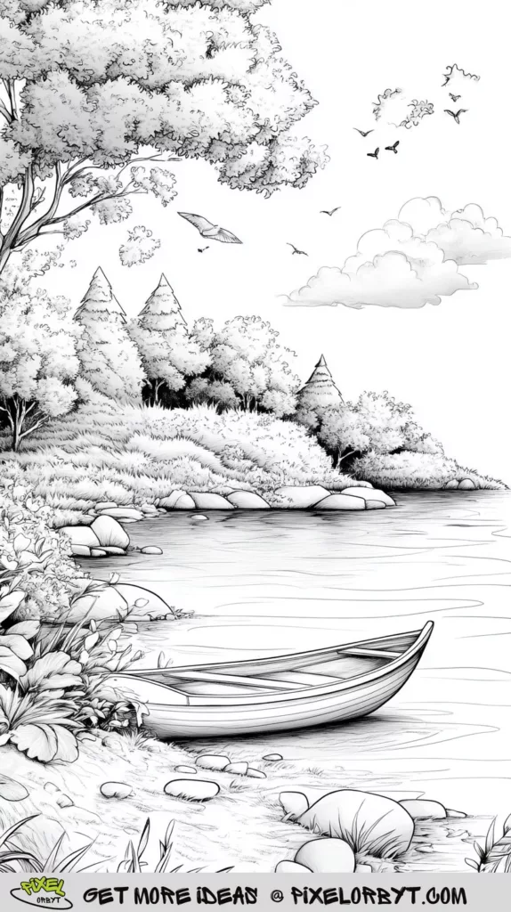
The lake is glassy, and glassy water means horizontal strokes and nothing else. Any vertical mark reads as a ripple. Keep it pale, and put a faint darker band directly beneath the trees where their reflection would fall.
The boat’s interior should be a good deal darker than its hull — that shadow is what tells the eye the hull is hollow. A few strokes of warm brown along the planking finishes it.
The wooded point behind the boat can stay as a single dark mass. Silhouettes are legitimate; not everything needs to be resolved. A dark shoreline is also what makes the pale water in front of it glow.
28. Palms Above the Bay
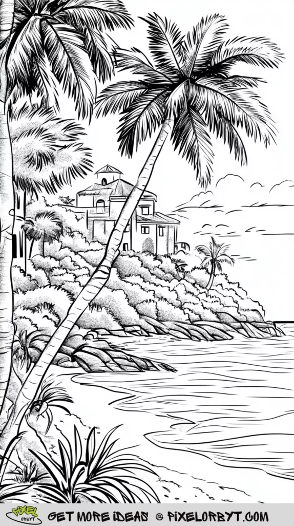
Palm fronds are drawn as many fine blades from a central rib, and colouring them as one green mass loses everything. Work outward along each frond, dropping to a deeper green on the underside blades, and they keep their feathering.
The bay should be lightest at the shoreline and deeper as it goes out. Two blues and a green, blended in horizontal bands, will do it. There is more coastline to work with in our beach and summer coloring pages.
The villa on the headland is small but it is the only man-made thing in the scene. A terracotta roof and a cream wall are enough. Anything more elaborate competes with the palms, and the palms should win.
29. Cobbled Path to the Stone House

Every cobble is drawn individually, which is a trap — give each one its own bright colour and the path becomes a mosaic that shouts over the house. Stay within two or three greys, vary them at random, and let the path recede quietly.
The mountains behind are drawn in the palest line of anything on the page. Match that with the palest colour you own, or better, leave them almost bare. The stone house and the shade tree are the subject; the range is only there to say how high up you are.
The boulders flanking the path have broad flat faces made for gradients — light where they face the sky, deep grey where they turn under. Get four or five of the largest ones right and the rest can stay simple.
Why Landscape Scenes Are Worth the Time
Landscapes give you something most coloring pages do not: distance. A portrait or a mandala sits flat on the page by design, but a valley has a front, a middle and a back, and the moment you start treating those three zones differently the drawing gains depth. That is a genuinely useful skill, and it transfers straight into your own drawing.
There is also no correct answer. Purple mountains and a green sky break no rule that the drawing was enforcing. Nature scenes are varied enough that every new page presents a slightly different problem — water one day, foliage the next — which is why a stack of them stays interesting far longer than a stack of the same subject. Our wider set of nature coloring pages works the same way, at a closer focal length.
Four Techniques That Change Everything
Aerial perspective, in one rule
Things get paler, cooler and less detailed as they go back. That is the whole rule, and it fixes more flat-looking landscapes than any other single change. Practically: mix a little blue or grey into every colour you use in the distance, and stop outlining things back there. The far conifer band in page 9 and the mountain wall in page 29 both live or die by this.
Let the paper be your lightest value
Beginners tend to cover every white area, then wonder why the finished page looks dull. Sunlight has no pigment. The moon in page 10, the crest of each dune, the glare on the river in page 1, the tops of the sheep in page 18 — leave them bare and everything you did colour will look brighter by comparison.
Layer lightly, three passes minimum
Press hard on the first pass and you flatten the tooth of the paper; nothing will sit on top of it afterwards. Build tone in thin layers instead, changing direction slightly each time. Skies especially want small overlapping circles rather than back-and-forth strokes, which is what leaves those visible streaks.
Match your medium to the line work
Pages with dense hatching — 14, 18, 19 — want colored pencils, because markers will drown the lines. Bold, open pages like 25 and 24 take markers beautifully. Watercolour suits the wide, simple skies of 5 and 15, though you will want to test a corner first, since most coloring-book paper buckles. If washes appeal, these watercolor painting ideas for beginners cover the paper and pigment basics.
Paper, Printing and Pressure
Standard copier paper is 80gsm and it will buckle under anything wet and pill under heavy pencil. If you are printing these at home, 120gsm or heavier makes a noticeable difference for a few pence a sheet, and it lets you build the three or four layers the denser pages want. Print at the largest size the page will take, too — the fine hatching in pages 14 and 18 becomes genuinely hard to work in at anything under A4.
One more practical thing: sharpen more often than feels reasonable. A blunt pencil cannot get into the narrow channels between contour lines, and half the frustration people blame on their pencils is really a tip that went round twenty minutes ago.
Ways to Get More Out of One Page
- Colour the same scene in two seasons. Page 15 in summer greens and again in October rust teaches you more about palette than two different pages would.
- Pick a time of day before you start. Midday means short shadows and strong colour; late afternoon means long shadows and a gold cast over everything. Decide first, then stay consistent.
- Fill the empty sky. Several pages here leave the top third almost blank. Add your own birds, a cloud bank, a flock heading out — it does not need to be detailed.
- Limit yourself to five pencils. Restriction forces you to mix by layering rather than reaching for a new colour, and the finished page holds together better.
- Keep the first one. Colour a page today, colour the same one in six months, and put them side by side. It is the clearest progress report you will ever get.
Frequently Asked Questions
Which of these pages should a beginner start with?
Page 15, the lone tree in the empty field, has the fewest lines and the most forgiving layout — almost nothing to go wrong. Page 24, the fenced lane, and page 2, the ploughed farmland, are close behind. Save the pastoral valley (18) and the forest stream (19) until you are comfortable, because both have hundreds of small shapes and are genuinely tiring in one sitting.
How do I stop distant mountains looking as heavy as the foreground?
Lighten and cool them. Use the same pencil you used in front but with a fraction of the pressure, then glaze a pale blue or grey over the top. Skip any outlining or texture in the distance, however tempting the line work is. Detail always reads as nearness, so removing it pushes the range back without you touching the colour at all.
Why does my sky always look streaky?
Back-and-forth strokes leave visible ends where the pencil changes direction. Use small overlapping circles with light pressure and build up three or four layers instead. A colourless blender pencil or a paper stump over the top will smooth what remains. Markers streak for a different reason — they need you to keep a wet edge and work fast, before the previous stroke dries.
Can I use markers on these pages?
Yes, and they suit the bolder drawings best, but slip a scrap sheet underneath first because alcohol markers bleed through almost any coloring-book paper. Lay the lightest colour first and layer the darker ones on top while the paper is still slightly damp for a smooth blend. On the densely hatched pages, markers will swallow the fine lines, so reach for pencils there instead.
How long should one page take?
The simple pages are a comfortable forty minutes. The detailed ones — the shepherd valley, the forest stream, the cobbled path — are three or four hours of real work, and they are far better spread across several sittings. Working back to front means you can stop at any point without leaving an obvious seam when you pick it up again.
Start Where Your Mood Is
There is no order to any of this. Some evenings a page with eight lines is exactly right; other evenings you want the flock, the stream and every stone in the streambed. Both are the same hobby. Pick the scene that matches how much attention you have to give tonight, keep your first layers light, and leave a little of the paper showing.