

28 Rose Coloring Pages: Simple Stems to Detailed Gardens
Roses are the flower most people try first and finish least often. The petals overlap in a spiral, the leaves have teeth, and a page that looked simple in outline turns into forty small decisions once you pick up a pencil. The 28 pages below range from a single stem a five-year-old can finish to a full-page cluster that will take an evening.

Each one is described by what is actually drawn on it and what that design asks of you, so you can pick by the amount of patience you have today rather than by the thumbnail. Difficulty here is mostly about two things: how small the shapes are, and how faint the lines are.
If the rose shape itself is still unfamiliar, the pencil version in these 28 easy flower drawings for beginners shows how those spiralling petals are built out from a small loose oval. The roses also sit alongside peonies, tulips and hibiscus in a wider collection of 42 flowers coloring pages, and there is a broader mixed set in these flower coloring pages.
28 Rose Coloring Pages, From Single Stems to Full Gardens
1. Classic Open Bloom

One bloom, seen straight on, drawn in a single even line weight with three leaves tucked underneath. The petals get larger as they spiral outward, so color from the tight center and work out, adding a little more pressure with every ring. That one habit is what makes a flat rose suddenly read as a cup. Nothing here is fiddly, which makes it the page to start on.
2. Minimalist Stem

A tiny bloom on a long straight stem, with the leaves filled solid black. Most of this page is empty white, and that is the point — there is almost nothing to color, so the decision that matters is what you do with the space. Two pencils are plenty. Children can finish it in five minutes, and it makes a good warm-up before a page with a hundred petals.
3. Sword and Roses

An ornate blade standing point-down, wrapped in rose vines with petals drifting loose around it. The lines are deliberately faint, which lets you make a real choice: cool gray steel against hot red roses, or the whole thing in one muted palette so the shapes matter more than the color. If this look appeals to you, the same flash-style pairing shows up throughout these tattoo drawing ideas.
4. Corner Border

Roses cluster in all four corners and leave a clean oval of white in the middle. Color the corners heavily and the blank center stops being empty — it becomes a frame for a name, a quote or a pressed flower. Keep the two diagonal pairs matching if you want it to look balanced, or break the symmetry deliberately with one odd color. Border pages are also the easiest to finish in short sittings, since each corner is a self-contained job.
5. Rose Over the Hills

A tall rose stands in front of ridge after ridge of rolling hills, with thin clouds streaked across the sky. The trick is atmospheric perspective: the furthest ridges want to be pale and slightly blue, each nearer one a shade warmer and darker, and the rose itself the only saturated thing on the page. That contrast is doing all the work. Anyone who enjoys the background more than the flower should look at these landscape coloring pages.
6. Half-Open Bud

A half-open rose on a thorned stem with two big veined leaves. The shapes here are the largest on the whole list, so it forgives markers, crayons and heavy-handed children. Use the leaf veins as boundaries and shade each section slightly differently — leaves that are all one flat green are what makes a colored flower look like a sticker.
7. Hand-Tied Bouquet
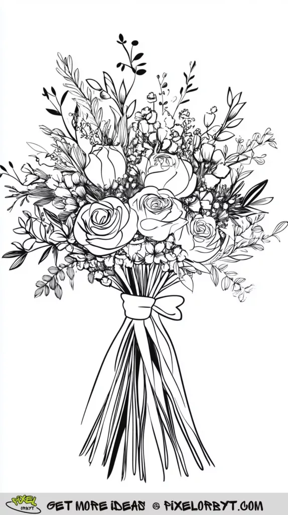
Roses, small filler blooms, berry sprigs and long cut stems bound with a modest bow. There are dozens of tiny shapes in this one, so decide on three or four colors before you start rather than picking as you go — a bouquet where every bud is a different hue turns into confetti. Let the roses lead and keep the fillers quiet.
8. Full-Page Cluster

Five roses and a mass of broad leaves packed right to the edges, with no background at all. Because every shape touches another shape, the only way to keep the blooms separate is to vary value: one rose pale, its neighbour deep, the leaves darker still where they pass behind. It is genuinely absorbing and takes a while — save it for an evening you actually want to spend.
9. Rose Spray

Four blooms on a branching thorny stem with sharply serrated leaves. The outlines are thick and confident, which means markers will not ruin it — the ink has somewhere to stop. Try giving each rose a slightly different stage of opening a different tone, from a pale bud at the top to a fully blown flower at the bottom.
10. Garden Archway
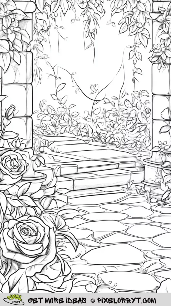
A stone arch smothered in climbing roses, with a flagstone path running under it and away into the garden. This is the most three-dimensional page in the set: the stones nearest you are large and clearly drawn, the ones further off shrink and blur. Warm grays for the stone, and let the greens get lighter and hazier as they recede. Scenes like this one sit alongside plenty more in these nature coloring pages.
11. Rose Crown Portrait

A close-up face, freckles and all, wearing a thick crown of roses with more blooms gathered at the shoulders. Much of the gray shading is already drawn in, so your job is to tint rather than fill: skin needs the lightest possible touch, and the roses can go as loud as you like. Anyone who enjoys drawing headpieces will find more of them in these crown coloring pages.
12. Rose at the Window

A large rose sits in front of an arched window, its leaves crossing the panes. The window is the reason this page works — glass gives you a flat, cool, evenly toned area to set the warm flower against. Keep the panes pale and slightly uneven, as if light is coming through unevenly, and the rose will jump forward without any extra effort. Resist the urge to draw a view through the glass; an empty window keeps the flower as the subject.
13. Rose Under Glass

One rose sealed inside a tall glass cloche on a round base — a fairy-tale image everybody recognizes. Glass is colored by not coloring it: leave the dome almost entirely white, add one soft vertical band down the left side and a thin bright streak on the right, and it reads as curved and transparent immediately. Everything inside the dome should be very slightly cooler and grayer than it would be in open air, which is what sells the idea of glass between you and the flower.
14. Victorian Frame

Five softly shaded roses inside a tall ornate frame, with scrollwork spilling out of the corners. The frame and the flowers compete unless you decide which one wins — classic answer is muted gold or sepia scrollwork with the roses in full color. A monochrome version, everything in one family of pinks, looks far more expensive than it has any right to.
15. Three Pencil Roses

Three roses at different heights on thorny stems, drawn loosely with visible pencil shading and set on a cream ground. The sketchy line quality means clean flat color will look wrong here; lean into it instead with light, scribbled layers that let the paper tone show through. It is closer to a drawing exercise than a coloring page, and it rewards a soft hand.
16. Wrapped Dozen

A dozen roses in a paper cone with a big bow at the base. Nearly half the page is wrapping, and folded paper is all about where the creases catch light: keep the flat panels pale, then run a slightly darker tone along each fold line. Do that and the paper stops looking like a triangle and starts looking like paper. Kraft brown, dove gray or plain white wrapping all flatter red roses more than a colored wrap does.
17. Snake and Rose

A snake winds down the stem of a single rose, set against a soft lilac-gray ground. The pairing works because the two forms move differently — the rose is all short overlapping curves, the snake one long unbroken line. Give the scales a cool metallic green and keep the petals warm so the eye can tell them apart at a glance.
18. Two Oversized Blooms

Two enormous roses fill the entire page, drawn in lines so faint they nearly disappear. Press hard and you will lose them under the pigment, so this is the page for building color in thin layers and stopping earlier than feels natural. The reward is a soft, almost photographic bloom that no bold-outlined page can give you. Work from the top of the page down if you smudge easily, since there is very little ink here to protect the paper.
19. Vase Arrangement

A tall narrow vase holding roses, tight buds and clusters of small filler flowers. The vase is drawn with very few lines, which makes it the interesting part: one dark edge down each side and a lighter strip up the middle is enough to make it look round and glazed. Color the arrangement in two families of color rather than six. A pale wash on the wall behind the vase gives the whole arrangement an edge to sit against instead of floating on white paper.
20. Climbing Branch

A rose branch runs corner to corner, carrying tight buds at one end and fully open blooms at the other. It is drawn in soft grays with a lot of overlapping foliage. Follow the diagonal with your color as well as your eye — palest at the bud end, deepest at the open end — and the page gains a direction most floral pages lack.
21. Giant Rose Head

A single rose head fills the sheet, ringed by broad overlapping leaves, all in the same steady line weight. Big simple areas like these are the best possible place to practise a gradient, because you have room to move slowly from a pale outer petal to a dark throat without any small shapes interrupting you.
22. Bold Wavy Petals

Ruffled outer petals, a straight stem and three large serrated leaves, all drawn in heavy high-contrast ink. The wave in those outer petals is the whole design: shade the underside of each ripple and leave the crest of it white, and the edge of the flower starts to turn in space instead of lying flat.
23. Quote Frame

A rectangular border with roses gathered in the top-left and bottom-right corners and nothing in between. The diagonal arrangement is deliberate, and it leaves a clean band across the middle for handwriting. Color the two corners as a matched pair so the eye travels between them, then keep your lettering in a color you have already used. Pencil the words in lightly first and check the spacing before you commit to ink.
24. Heart of Petals

A heart-shaped space sits open in the middle while faint roses crowd in from every side. Because the surrounding lines are so light, this page lives or dies on contrast: build the roses up until they are properly dark, leave the heart untouched, and the empty shape does the rest of the work for you.
25. Thorned Heart

A heart built entirely from thorny stems, with open blooms sitting at the curves and where the two vines cross at the base. The line is solid black and unapologetic. Reds are the obvious choice, but deep burgundy stems with cream flowers reads far less like a greetings card. It sits neatly beside these love sketching ideas if you like the subject.
26. Journal Page

Faint roses and leaves frame a central block of writing lines. It is half coloring page, half journal spread, and it works best if you treat the border as decoration rather than the main event — keep it pale and tonal so the writing stays readable. Good for a gratitude list, a recipe or a copied-out poem. Color the border after the writing is dry, not before, so a stray line of ink does not run into finished petals.
27. Butterfly and Rose Study

A patterned butterfly hovers among small roses at the top of the sheet while a large, heavily shaded rose anchors the bottom, with loose curls and droplets scattered between them. The two halves want different treatments: crisp graphic color in the wings, soft blended tone in the flower. Butterflies drawn at this level of detail turn up all through these butterfly coloring pages.
28. Butterfly Centerpiece

One big butterfly sits centerd between two shaded roses, with a faint mandala-like pattern spreading behind them and a small second butterfly in the top corner. The background is drawn much lighter than the foreground on purpose — keep it that way, use a single wash of one color back there, and save every strong tone for the butterfly and the two blooms.
How to Color a Rose So It Looks Like a Rose
Almost every flat-looking rose has the same cause: every petal got the same color at the same pressure. Five habits fix it.
Work From the Center Outward
Start at the tight spiral in the middle with your darkest tone and get lighter as you move out to the open petals. Real roses are darker in the throat because less light reaches it, and copying that one fact does more for depth than any amount of blending. On a big simple page like number 21 you have the room to make the transition slowly; on a dense page like number 8 you may only get two or three steps, which is still enough.
Layering beats pressing. Four light passes of the same pencil give a richer, more even color than one hard pass, and they leave you somewhere to go if you decide the petal needs to be darker. These colored pencil techniques cover the same layering habit in more depth.
Leave the Traditional Palette Alone Sometimes
Red and pink are the default, and they are not always the most interesting answer. A rose that shifts from teal at the outer edge to violet in the center still reads as a rose, because the shape carries the recognition and the color is free. Metallic hues — bronze, old gold, gunmetal — suit the fantasy pages especially well, and a bloom colored entirely in grays against a colored background can be striking.
Add Water Droplets and Highlights Last
A droplet is drawn with three marks: a dark crescent along the bottom edge, a much lighter body, and a small white dot near the top where the light hits. Put them near the petal edges rather than in the middle of a flat area, and use no more than five or six on a whole flower. A white gel pen over finished color does this in seconds; a fine white pencil works if you left the paper alone underneath.
Put Patterns Inside the Petals
Stripes following the curve of a petal, dots concentrated near the base, or a different pattern in every petal will turn a botanical page into something graphic and modern. This suits the bold-outlined pages best — numbers 9, 22 and 27 have the line weight to contain it. On the faint pages the pattern tends to overwhelm the drawing.
Give the Background a Job
A background either supports the flower or fights it. The safe version is a single pale wash of one color, kept lighter than anything in the bloom. The more interesting version is texture: a wood grain, brick, or a soft gradient from warm at the horizon to cool at the top. Pages 5, 10 and 12 already have their backgrounds drawn in; the rest let you invent one, and the empty-center pages — 4, 23 and 26 — are asking for it.
Why Roses Keep Turning Up
Roses have carried meaning for so long that people bring associations to the page before they start — love, grief, memory, celebration. That is part of why coloring one feels different from coloring a car or a cupcake. For children the value is more practical: the petals are curved boundaries that are genuinely hard to stay inside, and the leaves teach that green comes in twenty versions. For adults the repetition of petal after petal is the point, a slow task with a visible result at the end of it. It also asks nothing of you beyond staying roughly inside a line, which is a rare thing in an evening activity.
Rose Coloring Page FAQs
What colors make a rose look realistic?
Use three tones of one color rather than one: a pale version for the outer petals catching light, a mid tone for most of the flower, and a much darker version — often with a touch of purple or brown mixed in, not black — for the throat and the shadows where petals overlap. Black flattens petals; a deep plum or burgundy keeps them warm.
Which page should a beginner start with?
Number 2 or number 6. Both have large shapes and clear, heavy outlines, so there is little to stay inside and nothing small enough to be fussy. Avoid numbers 18 and 24 until you are comfortable, because their lines are faint enough to disappear under a heavy hand.
Are pencils, markers or gel pens best?
Colored pencils for anything you want to blend or shade, which is most of these pages. Markers for the bold-outlined designs where flat, saturated color looks deliberate — put a spare sheet underneath, as markers bleed through standard paper. Gel pens are for the last five minutes: highlights, droplets and small patterns over finished color.
Can these pages be used with children?
The simple stems, the bold spray and the wrapped bouquet suit young children easily. The dense clusters, the faint oversized blooms and the portrait have too much fine detail for small hands and tend to end in frustration. A good compromise for a mixed group is to give the adults the detailed pages and the children the border pages, where the blank middle becomes their own drawing.
Print at full page size, on the heaviest paper your printer will take if you plan to blend or use anything wet. Then pick one page, decide on three colors before you begin, and give the center of the flower somewhere darker to go.


